 Color Sets the Mood
How Picking the Right Hue Can Enhance the “Clean, Safe & Fun” Vibe
by Howard McAuliffe, Partner, Global Product Services and piaproducts.com
How can we expand our industry? That’s the million-dollar question, but in short, it’s hard to answer. I do believe by focusing on trends both inside, and maybe more importantly, outside our industry, we can learn more about what consumers want. That’s what this column is going to be about and for this inaugural “Now Trending,” let’s examine the importance of color trends.
In February, I attended a presentation on color trends for 2016/2017 from Laurie Pressman, the Vice President of Pantone’s Color Institute. (Pantone is a color authority for the graphics industry and others.) During this presentation, I was impressed by just much how color trends are a reflection of society. If you’re skeptical that color trends, which show up most obviously in fashion and home décor, are relevant to our industry, you’re not alone. I suspected there might be some useful information, but was surprised by how we can learn from color trends about our culture and what consumers desire. In order to begin thinking about color, I think the “Color of the Year” is a perfect place to start.
 As stated on the Pantone website: “What is the color of the year? A symbolic color selection; a color snapshot of what we see taking place in our culture that serves as an expression of a mood and an attitude.”
In this case, Pantone specialists decided for the first time that the color of the year would actually be a blend of two: Rose Quartz and Serenity (see the block at top).
The organization explained, “As consumers seek mindfulness and well-being as an antidote to modern day stresses, welcoming colors that psychologically fulfill our yearning for reassurance and security are becoming more prominent. Joined together, Rose Quartz and Serenity demonstrate an inherent balance between a warmer embracing rose tone and the cooler tranquil blue, reflecting connection and wellness as well as a soothing sense of order and peace.”
The key takeaway from this explanation of the color choice is that people are yearning for reassurance and security. This makes sense as a reaction to the following powerful forces in society:
1) Technology is changing quickly, growing more powerful and connecting the world like never before, which bombards us with information on an unprecedented scale.
2) 2016 is an election year, and politics have hyper-polarized us, bringing to the surface powerful issues related to religion, race, culture, as well as socioeconomics.
3) The economy is getting better, but it’s been a very slow recovery and many groups of people have been left out.
It’s natural that as a reaction to these high stress issues we are bombarded with, people want a place and a way to escape and relax. It’s no coincidence that these two colors are muted, calm shades of the red and blue used to symbolize American politics.
If consumers desire a respite from this chaotic environment, how can we provide it? A few hours at a facility having fun comes to mind. Even a few minutes playing a crane or other machine on the way to the grocery store can be a simple pleasure and break. The stated mission of the facilities I’ve helped manage has been to provide a “clean, safe, and fun” environment. Again, Pantone stated that “consumers seek mindfulness and well-being as an antidote to modern day stresses.” We can create places and opportunities for consumers to find what they’re seeking.
While studying trends, in this case those related to color, there are also specific ways we can use color. My wife and I both work and are blessed to have very full lives, but all that can be stressful. On Saturdays, our 3-year-old has a language class, and I used to look forward to my wife taking him, giving me two hours of quiet. However, once I took him myself a few times, I realized that the waiting area is very calming. It has warm color tones, quiet music with visually calming images playing on a TV screen, as well as coffee and plenty of comfortable seating. I enjoyed sitting there and reading or doing work. It turns out so do other parents, who I’ve become friends with. Now, I look forward to that social time in a nice setting each Saturday morning. I actually prefer going there to sleeping-in or being in my own home.
So what does this all mean to a family entertainment center or other location? I believe there are three key areas we can use color:
1) Seating areas can be easily decorated using calming colors and items that attract parents, as well as kids.
2) Party rooms can be painted, or at least decorated, with tablecloths, napkins, plates and other accent pieces with soothing colors. Remember to always have these rooms decorated and ready to go, even when not being used, as an advertisement for anyone considering a party location.
3) Pay closer attention to the colors we use in prizes and how they are displayed.
Hopefully, I’ve convinced you that studying trends, specifically color, can provide clues to what our customers really want. How can we better use this information and/or color itself to enhance our offerings? There are certainly multiple answers, and even more questions that will vary by location, but I’m convinced thinking about the answers will help us all thrive.
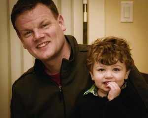
Howard McAuliffe loves to imagine and implement new products, business models, and ideas, and is a partner in Pinnacle Entertainment Group Inc. He’s an industry veteran who got his start in the business when he was just 16 and has 20 years of expertise in product development, as well as FEC and route operations. Howard’s wife Reem and young son Sami are the center of life outside of work. When he’s not working, Howard can be found enjoying the outdoors, hiking, fishing and mountaineering. Traveling anywhere new or to old favorites like the American West is a passion. Readers can visit www.grouppinnacle.com for more information or contact Howard at howardmc@grouppinnacle.com, he welcomes positive as well as constructive feedback and counterpoints.



1 Comment
great article I love it